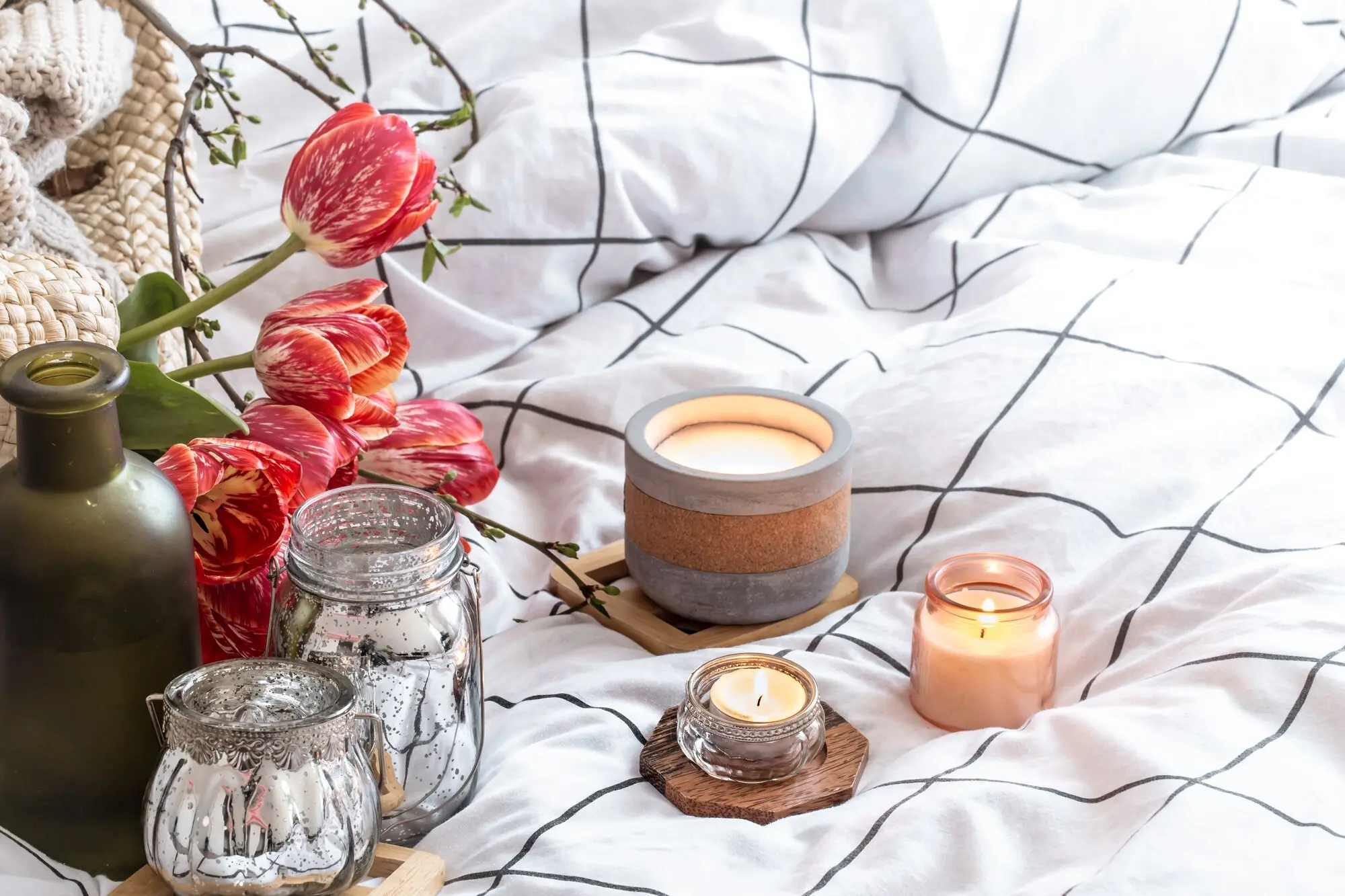
When Color Lights the Room

Today we explore color psychology in candle making, focusing on wax dyes and mood-setting hues that turn simple wax into atmosphere. Learn how pigments dissolve and behave, how shade and saturation shape emotion, and how to match color with fragrance, vessel materials, and lighting. We will cover practical techniques, testing for stability, cultural nuances, safety, and engaging storytelling so every candle you pour carries intention and delivers a memorable, comforting experience.

Seeing Scent: How Color Shapes Experience

Color is the first promise a candle makes before the wick is even lit, priming expectations about warmth, freshness, sweetness, or silence. Decades of research show that warmth, saturation, and contrast redirect attention and memory, changing how we perceive scent throw, burn time, and even value. A small studio once found their cool-gray eucalyptus candle outsold brighter greens, because the restrained shade suggested spa-level clarity rather than overpowering minty sharpness.

Warm Comfort, Cool Clarity

Oranges, ambers, and russets tend to suggest comfort foods, hearth heat, and soft conversations, enhancing gourmand and wood-forward blends. Blues and sea-glass greens whisper openness and breath, supporting airy herbs, ozone, and marine accords. Balance matters: a warm candle label with a cool wax body creates engaging tension, inviting curiosity without overwhelming the senses. Test these pairings under natural and evening light, since warmth perception subtly shifts with ambient temperature cues.

Saturation, Value, and Perceived Strength

Deep, saturated color often implies bold fragrance, while pale, high-value tints can signal minimalism and serenity. This visual cue steers burn-time expectations too, with darker candles sometimes assumed to be stronger or longer-lasting. Match dye load to message, not only to aesthetics. A soft pastel can still carry confident projection if the fragrance and wick are tuned. Provide clarity on labels, guiding customers so visual intensity and aromatic intensity feel aligned and intentional.

Cultural Nuance and Expectations

Color meanings shift by region and memory. White can speak of purity, beginnings, and quiet rooms, yet also of mourning in some traditions. Red may evoke love or festive abundance, but also alertness or caution. When crafting palettes for gifts or seasonal releases, listen to your audience, gather feedback, and consider local holidays. A small survey can reveal surprising associations, helping you fine-tune hues so they resonate across diverse households without diluting your creative voice.

Choosing and Using Wax Dyes

Not all colorants melt, mix, and burn alike. Liquid dyes offer fine control and fast dispersion, while dye chips or blocks provide convenience and repeatability. Candle-safe dyes differ from craft pigments meant for soaps or cosmetics. Some colorants can migrate, bleed, or shift under heat and UV, especially in soft waxes. Learn solubility, recommended load, and compatibility with soy, paraffin, coconut, or beeswax, then document every ratio so scaling production remains stable and trustworthy.

Matching Dyes to Wax Types

Each wax family brings quirks. Soy may lighten during cure and show frosting that hides subtle hues; paraffin usually amplifies brilliance; beeswax’s natural tint can warm cool palettes; coconut blends can mute saturation. Start with manufacturer guidelines, then push in small increments, noting pour temperature and stir time. Keep a swatch library using identical vessels and wicks, because a color that looks rich in a test mold can turn surprisingly translucent in final jars.

Achieving Consistent Batches

Consistency starts with measurement discipline. Use precise scales or calibrated droppers, pre-dissolve blocks evenly, and add color at the same temperature window each time. Stir for a standardized duration to avoid streaks and micro-banding. Record batch codes, dye source, and lot numbers, since minor shifts between suppliers can alter tone. Create visual checkpoints under daylight-balanced bulbs and warm indoor lighting, approving only those shades that pass both views and match your reference card precisely.

Designing Mood-Setting Palettes

Thoughtful palettes translate feelings into light. Use color psychology to sculpt experiences: complementary contrasts for dynamic rooms, monochromes for quiet corners, or analogous gradients for gentle storytelling. Consider vessel opacity and label hue as integral swatches, not afterthoughts. Pair fragrance families with temperature: herbal notes with cool greens, smoky resins with umbers, citruses with sunrise corals. Create signature palettes that help returning customers recognize your hand instantly, even before they glimpse a logo or hear a name.

Techniques for Expressive Color Effects

How color enters the wax changes the story. Layering, ombré fades, marbling, embeds, and dye micro-dosing create movement and rhythm. Each method affects heat dynamics, adhesion, and surface finish. Record pour temperatures and waiting intervals, and keep wicks centered despite transitions. Be mindful that heavy particulate shimmer belongs in melts, not wick candles. With practice, your pours will read like chapters: beginnings set by pale tones, crescendos marked by depth, and endings resolved by gentle light.

Guarding Against UV Fade

Place duplicate candles in bright window light, indirect daylight, and a closed cupboard for several weeks. Photograph weekly with a neutral gray card to monitor drift. Some blues and violets are notorious for fading. Consider UV inhibitors compatible with your wax system, darker vessels, or protective sleeves. Educate customers about storage away from direct sun. By presenting before-and-after photos in your shop or newsletter, you build trust while showing the disciplined care behind every finished candle.

Heat, Cooling, and Surface Finish

Color clarity depends on thermal choreography. Overheating can skew hue; pouring too cool invites jump lines, sinkholes, or matte veiling. Control ambient temperature, pre-warm vessels, and cool gradually to discourage frosting in natural waxes. Keep a thermometer and timer as constant companions. If frosting appears, test minor adjustments in pour temperature and additives, or embrace it artistically with colors that complement crystalline texture. Document which combinations withstand seasonal swings so production remains calm during climate surprises.

Burn Performance and Wick Choice

Color load and additives subtly change viscosity and melt pool behavior, shifting how wicks perform. A dye-heavy candle might need a different series or size. Run full burns from top to bottom, logging flame height, mushrooming, soot, and container temperature. Compare colored and undyed controls to isolate variables. Your goal is harmony: a stable flame, clean glass, and a melt pool matching vessel diameter in reasonable time. When performance sings, color feels purposeful rather than merely decorative.

Branding, Storytelling, and Customer Delight

Color is part of your signature. Cohesive palettes across labels, wax, and photography create instant recognition in feeds and on shelves. Name shades evocatively, connect them to places or rituals, and explain intention in a sentence customers can remember. Invite conversation: ask which colors calm their kitchens or energize their studios. Share behind-the-scenes swatches and failures too. Trust grows when people see your care, and they return for refills because the story feels alive in their hands.
Names steer imagination. Instead of “Blue No. 4,” try “Harbor Dawn” or “Quiet Linen,” then back it with a short card describing why the hue supports certain rituals. Mention the fragrance pairing, burn notes, and a personal memory that sparked the palette. Many customers choose gifts based on narrative resonance. When words, color, and scent align, unboxing becomes a small ceremony, and the candle carries meaning beyond décor, living on as a reminder of shared environments and moments.
Your box, label stock, and protective wrap continue the chromatic promise. Matte papers temper glare and elevate soft hues; clear labels let color be the star. Photograph candles next to textured textiles or natural woods that echo palette temperature. Capture both daylight clarity and dusk warmth, since buyers light in varied rooms. Consider surprise touches like a tiny swatch card inside each box. Customers often keep these cards, multiplying brand presence on desks, dressers, and inspiration boards.
Invite readers to comment with their favorite evening colors, request palette experiments, or share photos of how your candles live in their homes. Offer a quick survey after purchase and a newsletter showcasing seasonal color studies. Encourage subscribers to vote on limited editions, then report back on results. People love seeing their input reflected in the next pour. This ongoing dialogue transforms casual interest into belonging, making every new release feel like a shared, co-created moment of light.
Lororavovarotunoviro
Privacy Overview

This website uses cookies so that we can provide you with the best user experience possible. Cookie information is stored in your browser and performs functions such as recognising you when you return to our website and helping our team to understand which sections of the website you find most interesting and useful.